knobs
Connecting electronic music enthusiasts with industry veterans.
iOS Mobile app
Project overview
Challenge
Music production journey is exciting but overwhelming. The biggest issue is struggling to produce sound you imagine due to a complicated software/hardware and there is not enough organized place where one can find solution to exact problem they experience.
What have I done?
I am the sole UX/UI designer of this ongoing project.
How can I help?
I will create iOS mobile app where users can easily find a mentor who will walk them through any process of their interest.
Tools
Figma
Adobe XD
Persona
User persona below is created as a result of interviews with the participants of different advancement level and affinity mapping.
Thylane, 28
NEW YORK, WAITRESS
Thylane finds it hard to find help with music production questions. She gets overwhelmed with the amount of information while trying to hone her skills.
Needs
needs an organized place where she can easily find a subject she is interested in exploring due to the complexity of music production
needs a helping hand while discovering software/hardware
Frustrations
not being able to generate the sound she envisions due to a feature she does not understand
inability to find the exact answer to her problem
looking for solutions online is a hit or miss
Behaviors
music session 3/week
uses Skype and Zoom’s screen share option for communication
goes to YouTube tutorials for educational purposes
“It would be nice if online forums were organized according to different categories of topics or tools so it’s easier to find help”
Brands
Next up
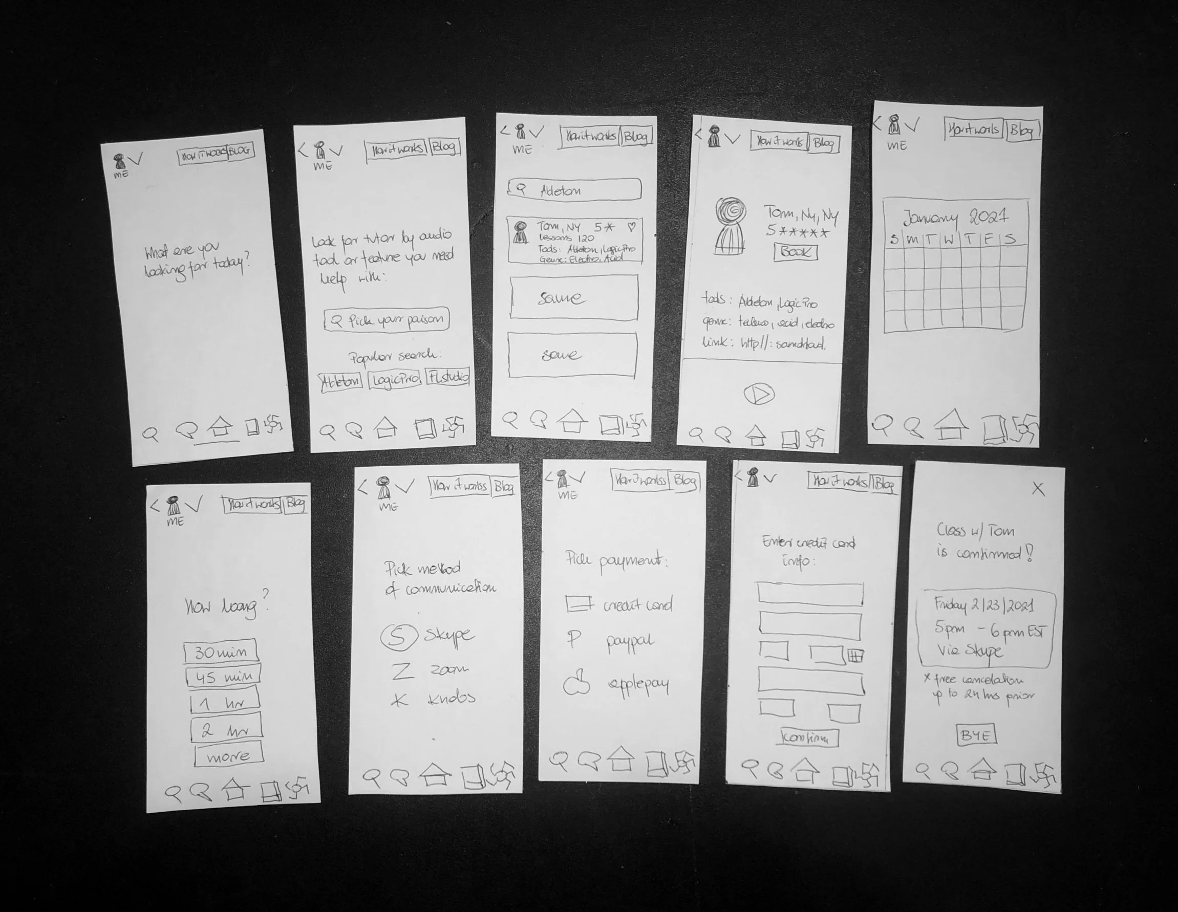
I created user flows to better step into Thylane’s shoes and made a site map based on the results from open card sorting to make sure I am not listing and naming categories subjectively. Once done I moved on to working on screens.
Low fidelity
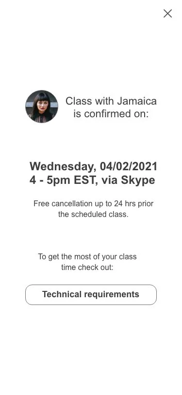
User books a class with a tutor
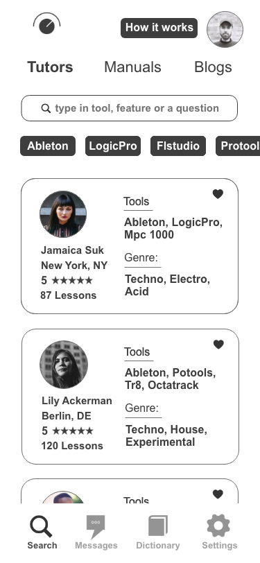
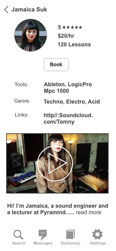
Mid fidelity
User books a class with a tutor
I got rid of 2 intro screens after testing and making sure the user will feel at home with just a search screen.
Mid fidelity
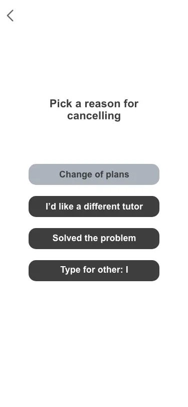
User cancels the scheduled class
Testing & improvements
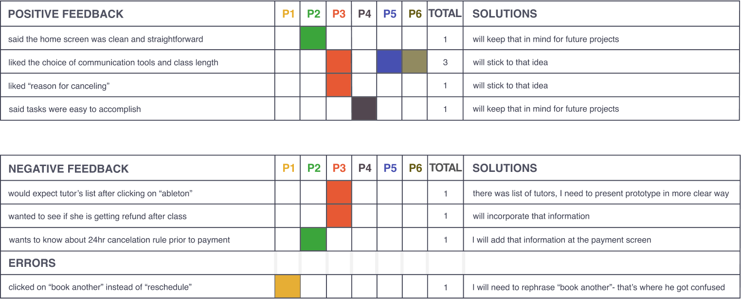
Excited to step into the human psychology part, I conducted usability tests (using above mid fidelity screens) and put the results together in form of the rainbow sheet.
Rainbow spread sheet
Based on my findings I separated the most prominent issues, estimated how severe they were, and applied solutions which will reflect in the final screens.
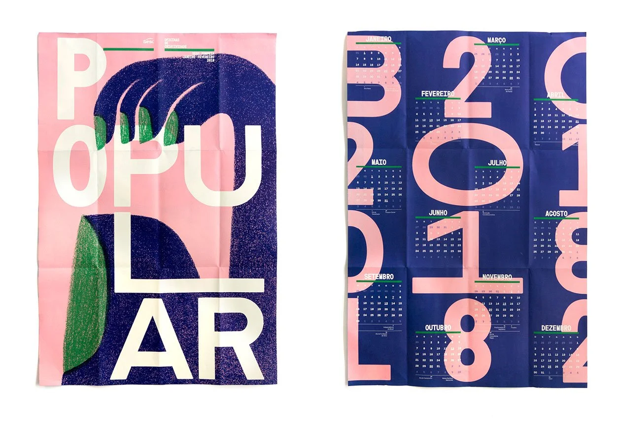
Visual inspiration
After studying popular music apps I knew it needed to be dark theme so I presented dark blue and green for A/B testing and the winner was the dark blue.
With that in mind I found this art while visiting Fonts In Use. I was drawn to how the light creme font looked against the navy blue.
Color palette
I kept cream, blue and picked orange as an accent color as it seats exactly on the opposite side of dark blue on the color wheel.
Primary color
#3d3f51
Secondary color
#eaeaea
Accent color
#e58036
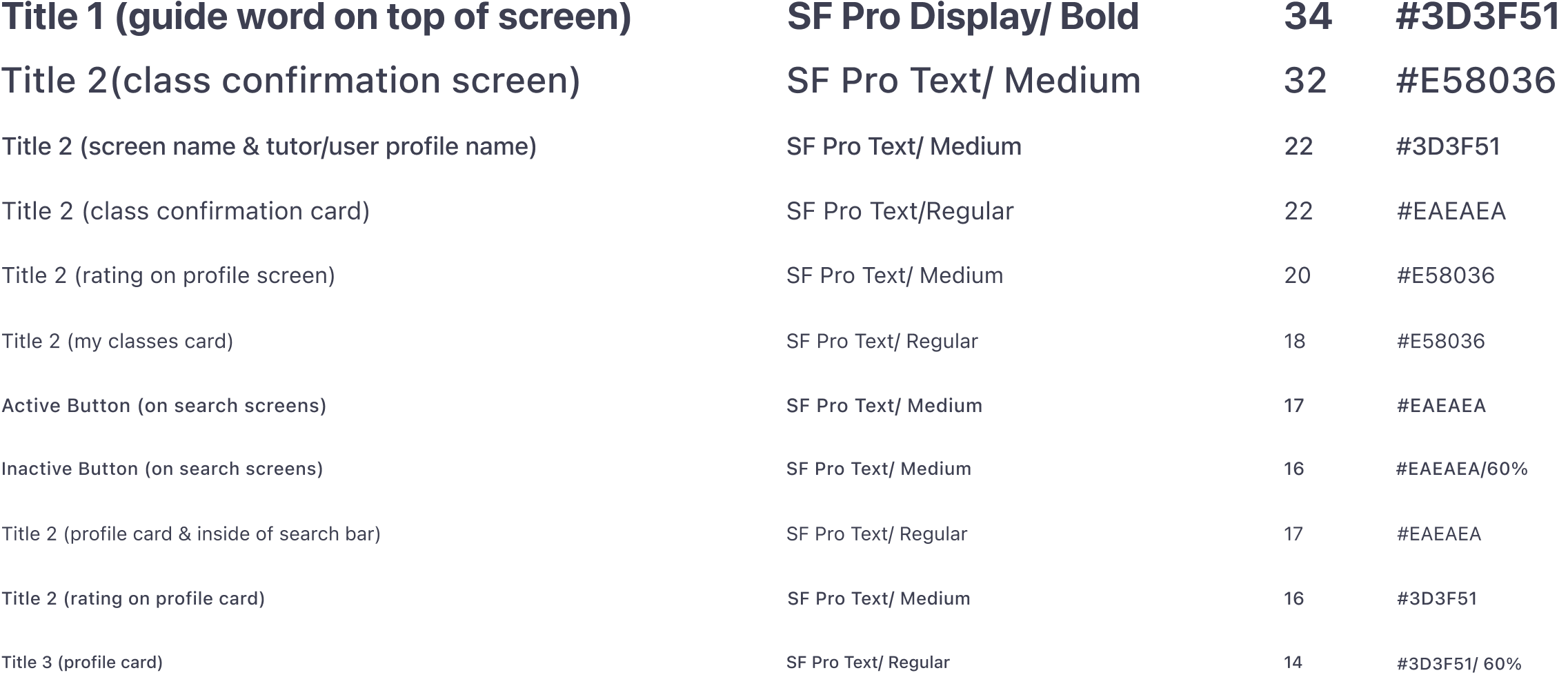
Typography
Hi fidelity screens
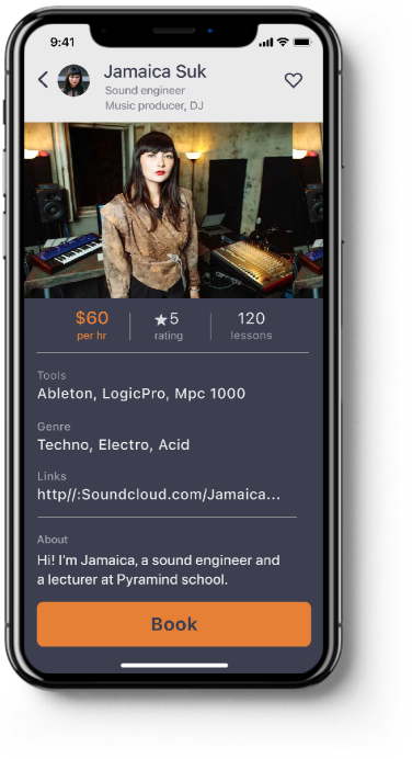
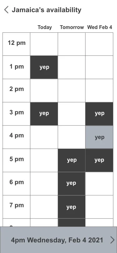
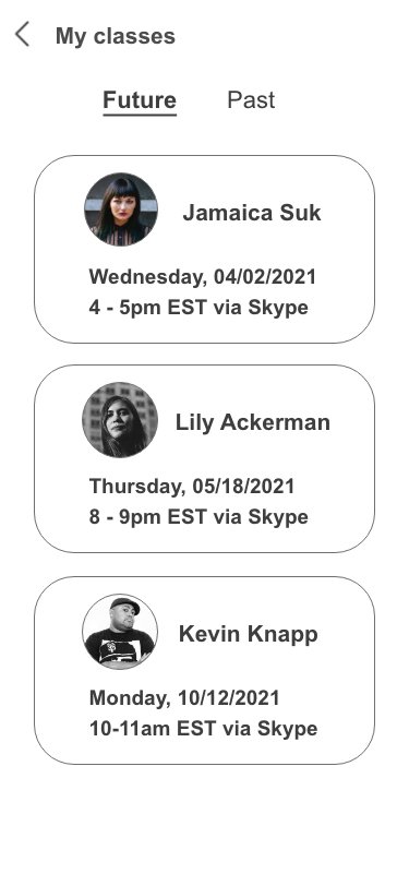
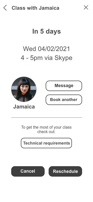
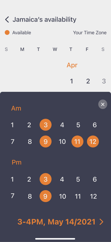
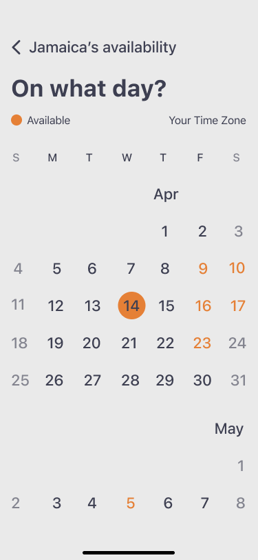
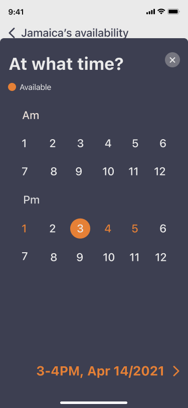
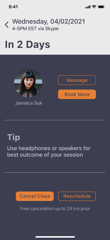
Presenting hi fidelity screens and improvements made as a result of usability testing.
Calendar
I used iOS devices calendar as inspiration.
Prior
Current step 1
Current step 2
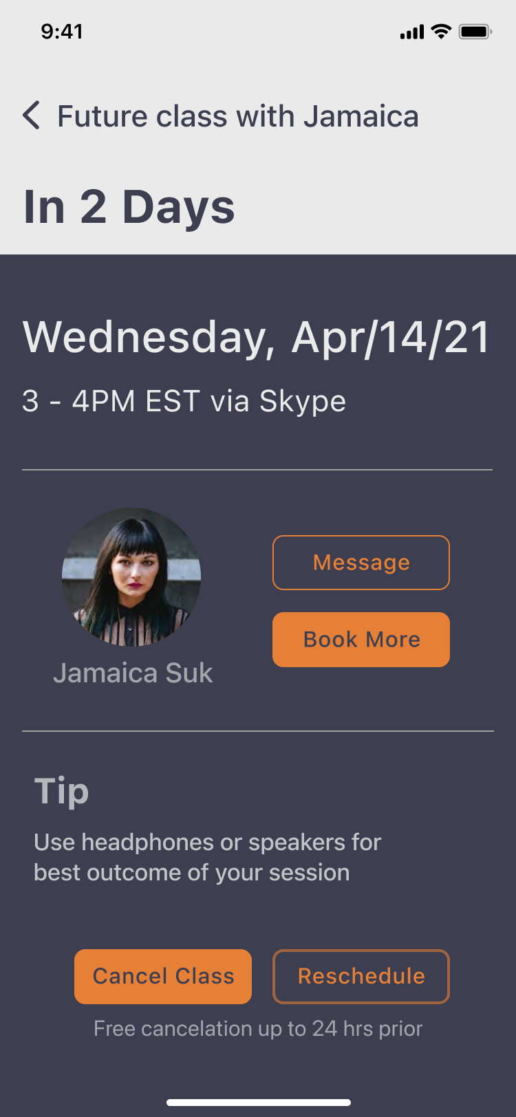
Future class info
Prior
Current
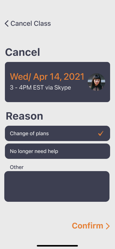
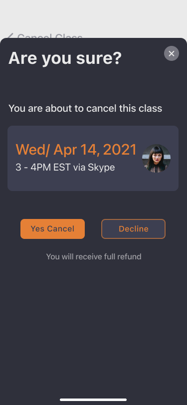
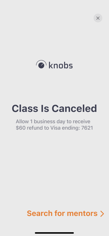
Cancel class process
Current step 1
Current step 2
Current step 3
Walk through
Thoughts
“After you’ve worked on a site for even
a few weeks, you can’t see it freshly
anymore. You know too much.”
- Steve Krug
I lived by that quote throughout practicing UX and later, I have been utilizing it while working on UI part of knobs.
Testing is and always will be the fundamental part of everything UX but I also think a grain of common sense is needed while making changes to the design, as there are several layers while working on a project such as business layer.
